Exciting news! We wrapped up our rebranding excercise by refreshing our logo and introducing a new name for our mentoring program; Open Seeds! The new logo reaffirms our core values Growth, Community and Nurture, with a cohesive colour palette. We’re excited to launch our refreshed brand identity and continue our commitment to advancing open research and scholarship.
This post is written by Jilaga Nneoma, OLS’s rebranding Outreachy intern, summarising the incredible logo redesign she did over the end of 2022 and first two months of 2023. Now that her internship’s finished, you can contact her via email nneomajilaga@gmail.com. If you’re interested in snagging her incredible talents for your own work, or browse her portfolio here
Greetings!
It has been quite an exciting journey for us here at Open Life Science (OLS) as we navigate the challenges of expanding our brand identity. As you may have noticed, we recently conducted a rebranding exercise to help us create a new brand identity that aligns with our core values and reflect our growth to include a diverse community of researchers and scientists from a variety of fields.
Initially, we set out to rebrand our name and logo to better represent our mission and core values. However, after careful consideration and feedback from our community, we have decided to keep the acronym OLS as our name. This decision was reached because of the strong association our community members have with the OLS name and what it stands for.
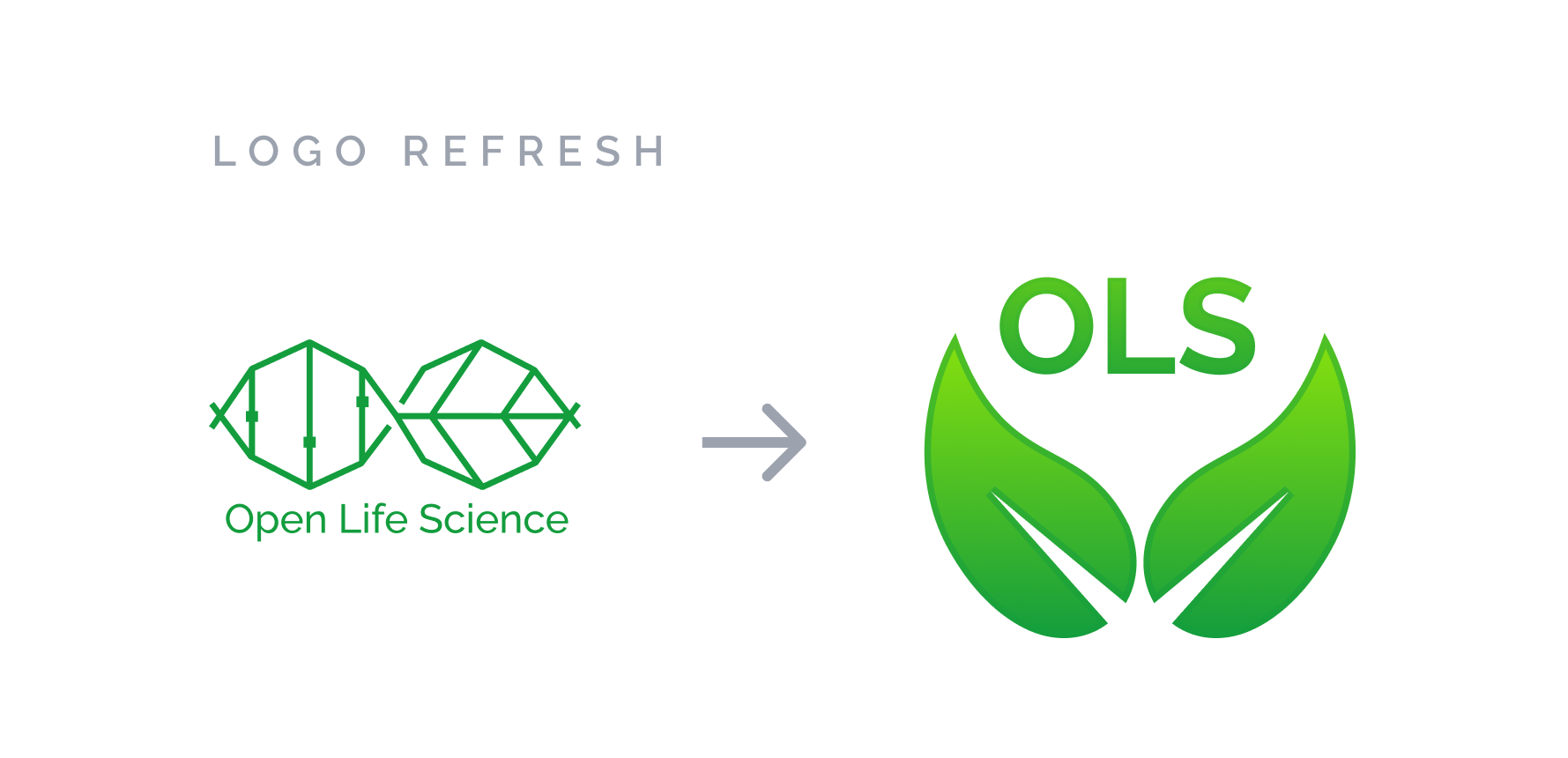
Nevertheless, we remain committed to improving our brand identity and expanding our reach. As part of this effort, we have refreshed our logo to give it a more modern look while still retaining the essence of our identity.
The New Logo

The new design features a simple yet dynamic logo mark that conveys the concept of community, growth and nurture.
The Shape

Plant seeding is a powerful growth metaphor that symbolises new beginnings, potential, and growth. Just as a seed needs the right conditions to germinate and grow, individuals and ideas also require the right environment and support to thrive.
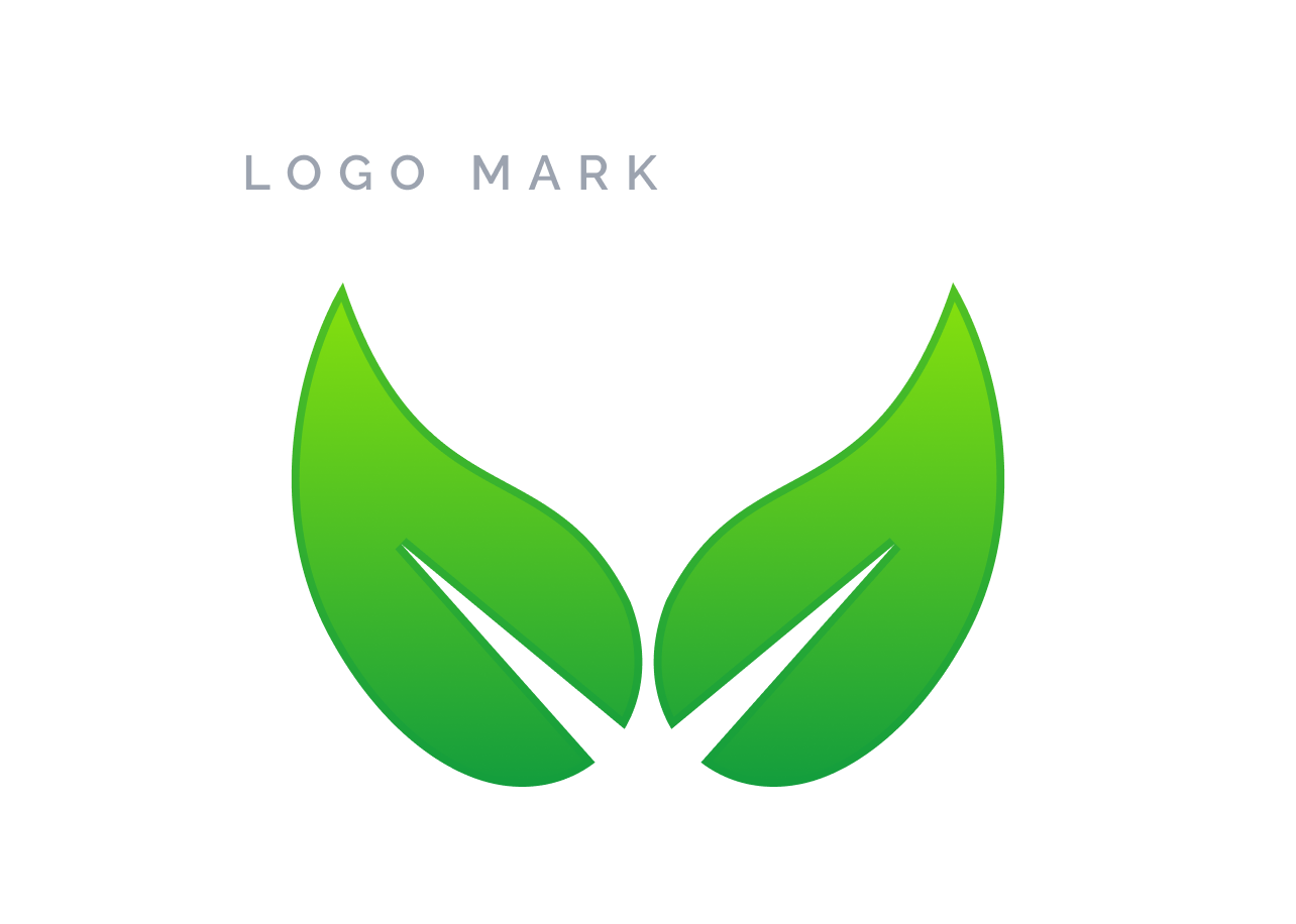
The logo mark consists of two seeding leaves, which were carefully selected to represent growth and nurture. The two leaves are designed to symbolise the collaborative nature of OLS and the community it supports.
The joined petioles of the leaves represent the strong bond that exists between OLS and its community, where knowledge and ideas are shared freely, and individuals are encouraged to grow and thrive. They also mimic the openness in OLS. The organic shapes of the leaves evoke a sense of natural growth and development.
The Colour

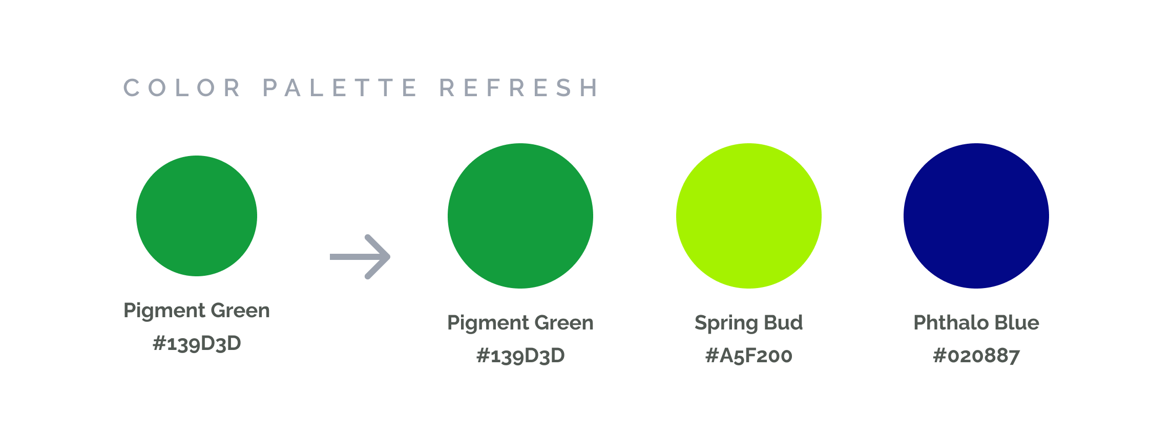
These colors were chosen to represent growth, vibrancy, and innovation.
- Pigment green is a fresh and vibrant shade, representing the growth and renewal that OLS aims to promote in the research community.
- Spring bud, a soft and uplifting shade of green, represents the nurturing environment that OLS provides for its mentees.
- Phthalo blue is a bold and dynamic shade that represents the cutting-edge research and innovation that OLS is known for.
Finally, the soft gradient at the tip of the leaves blend together in a way that creates a sense of continuity and fluidity while adding visual interest and complexity.
Finally, the soft gradient at the tip of the leaves blend together in a way that creates a sense of continuity and fluidity while adding visual interest and complexity. The new brand colors will be incorporated across all of OLS’s platforms, from our website to all our social media channels to create a unified and recognizable brand identity.
Open Seeds Mentoring and Training Program

Open Seeds is the new name for the OLS mentoring program, reflecting their commitment to growing and nurturing talent within our community. It represents our focus on providing support and resources to help new ideas and projects flourish, while also honouring the spirit of openness and collaboration that is central to our mission. With Open Seeds, OLS is planting the seeds of innovation and cultivating a community of leaders who will shape the future of research and discovery. Open Seeds is the new name for the OLS mentoring program, reflecting their commitment to growing and nurturing talent within our community. It represents our focus on providing support and resources to help new ideas and projects flourish, while also honouring the spirit of openness and collaboration that is central to our mission. The new Open Seeds logo builds on the refreshed OLS logo, featuring the two seedling leaves to mimic growth sprout. The logo communicates the values of the Open Seeds mentoring program, providing a fresh and modern identity that represents the program’s mission to nurture and grow open scholarship initiatives.
Conclusion
The rebranding exercise has been an exciting journey for us and we have gained valuable insights from the community, which have helped us in making informed decisions about our brand identity. We are thrilled to have settled on Open Seeds as the name for our mentoring program and are excited about the prospects of this.
Our refreshed brand identity also captures the essence of our mission, and we are confident that it will resonate with our community.
As we move forward, you may have noticed that we have started incorporating our refreshed identity in our slides and stickers. Over the next few months, we will be slowly rolling it out across all our channels. In Q3 of 2023, we plan to update our website too.
We appreciate everyone who participated in the voting process and provided us with feedback.
